Design
Instagram's New Logo Reads as Instagzam. Blame Cursive
Instagram's 2026 wordmark got read as 'Instagzam' within hours. The misread tracks a real change: Ontario made cursive optional for 17 years, and most US states dropped it after Common Core.
Adam Mosseri published Instagram's new wordmark on August 13, 2026, and the internet finished reading it wrong within the hour.
"We updated the Instagram wordmark today, which is more than a decade old and felt dated," Mosseri wrote on Threads and Instagram. "We feel the refresh is sharper and more modern, but references the original and has the simplicity and craft that's always made it Instagram." His two posts collected more than 5,000 replies, and a large share of them said the same thing: it says Instagzam.
It does not, of course. The lowercase r has been redrawn with a rounder shoulder that closes toward the g beside it, and the eye fills in the rest. That misreading has been treated as a design flub, a joke about a kerning accident. It is better understood as a reading test that a very large group of people just failed, for reasons that have nothing to do with Instagram and everything to do with what schools stopped teaching in 2006.
What actually changed
The refresh touches the logotype, not the app icon. The camera glyph stays; Instagram says the gradient will simply be used more sparingly from here. The letterforms are more compact and heavier, the s, r and g are noticeably rounder, and the whole thing keeps the handwritten posture of the 2016 wordmark while tidying up its joins. It arrives with a wider brand system of fonts, icons and formats, and it rolls out gradually through 2026 rather than flipping worldwide overnight.
That is a conservative brief, executed conservatively. The complaint is not that Instagram went abstract. It is that the one word the company owns outright got harder to parse.
The rest of the reaction split along familiar lines. Some design commentators filed it under "peak blanding," the decade-long drift of every consumer brand toward the same quiet, rounded, fashion-adjacent lettering. Others thought it was simply cleaner than what it replaced, and a contingent of users used the replies mainly to complain about the feed rather than the font. Only the Instagzam read was close to universal, which is the part worth taking seriously: aesthetic preference splits an audience, a legibility failure does not.
The joke is a literacy result
Cursive is a system of joined letters, and reading it is a learned skill distinct from writing it. A reader trained on joined script parses a run of connected strokes as a sequence, using the entry and exit strokes of each letter to work out where one ends and the next begins. A reader who was never trained on it parses the same run as a set of isolated shapes and matches each shape against the printed alphabet it knows.
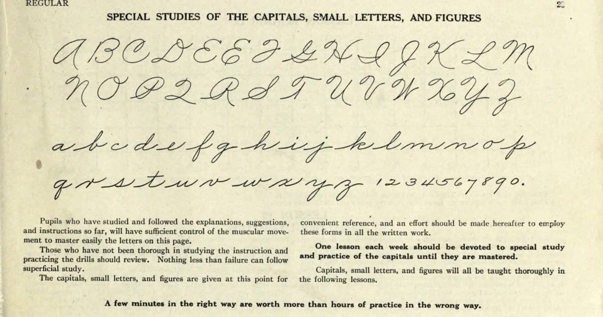
Look at the Palmer Method chart at the top of this article, the alphabet North American schoolchildren copied for most of the twentieth century. The lowercase r in it is a flat-shouldered stroke with a small hitch on top, and it resembles a printed r almost not at all. Nobody who learned that alphabet found it ambiguous, because they had been drilled on the stroke rather than the silhouette. Instagram's new r is far less exotic than Palmer's, and it broke anyway.
There is laboratory support for the idea that writing letters is what builds the machinery for recognising them. In a 2012 study published in Trends in Neuroscience and Education, Karin James and Laura Engelhardt had preliterate five-year-olds print, type or trace letters before scanning them with fMRI. The brain's established reading circuit was recruited during letter perception only in the children who had printed the letters by hand, not in those who typed or traced them; the printing group showed greater activation in the left fusiform gyrus. The study is about manuscript printing rather than cursive, and it is one experiment on young children rather than a verdict on adult reading. But it points at the mechanism underneath the joke. Producing a letterform is part of how the brain learns to tolerate variation in it, which is exactly the tolerance a stylised r demands.
Ontario spent 17 years not teaching it
Cursive was demoted to optional in Ontario's elementary curriculum in 2006 and only became mandatory again, from Grade 3, in September 2023. That is 17 school years in which an Ontario child could pass through the entire system without a required cursive lesson, and the students who sat in those classrooms are now roughly 12 to 28 years old, which is very close to the middle of Instagram's user base.
Ontario's reversal did not come from nostalgia. It landed alongside a broader curriculum rewrite that followed an Ontario Human Rights Commission report finding the province's reading instruction was failing students with reading disabilities, and it shipped in the same package as mandatory phonics in kindergarten and typing from Grade 4. Cursive came back as part of a literacy correction, not a heritage project.
The United States did the same thing, and is unwinding it
The Common Core standards published in 2010 left cursive out and put keyboarding in; 41 states adopted them in 2011, dropping the requirement in the process. States began putting it back around 2016, and Wikipedia's tally of state mandates stood at 25 as of July 2024, though counts vary by source and by how strictly "require" is defined.
The most recent addition is Pennsylvania. Governor Josh Shapiro signed Act 2 of 2026 into law on February 18, adding printing, joined italics and cursive to the state school code effective April 12; the Pennsylvania Capital-Star reported it would make Pennsylvania the nineteenth state with such a requirement. Senator Wayne Langerholc, one of the sponsors, framed it as more than penmanship: "By reintegrating cursive into the curriculum, we are not simply teaching handwriting, we are investing in our students' cognitive development, strengthening their legal preparedness and preserving their connection to historical literacy."
Legislators have generally argued the case from documents and signatures, that historical records are in cursive and a joined signature is harder to forge. The Instagram reaction supplies a plainer argument. A brand can no longer assume its audience can decode script.
Why Coca-Cola gets away with it
The obvious objection is that plenty of script wordmarks are doing fine. Coca-Cola has been Spencerian since the 1880s, Kellogg's is a signature, Barbie is a swash, and nobody misreads any of them.
They are not being read. A logo that has been in continuous circulation for a century is processed as a single shape, closer to a pictogram than to a word, and its letterforms could drift a long way before anyone noticed something was off rather than misidentifying the letters. That is the protection an old script mark buys, and it takes decades to accumulate.
Instagram's wordmark is ten years old and has just changed, which puts it in the worst position available: familiar enough that people expect to recognise it instantly, new enough that they have to actually decode the letters to confirm what it says. Any brand refreshing a script mark inherits that window. The safe version of it is a redraw where the ambiguous pairs are resolved before launch rather than discovered in the replies.
There is also a precedent inside Instagram's own history that cuts the other way. The 2016 redesign, which retired the skeuomorphic Polaroid-style camera for the flat gradient glyph, was mocked at least as loudly and is now the icon nobody would touch. Ridicule at launch is a weak predictor of what a mark is worth in five years, and Instagram clearly knows it.
The difference is that the 2016 change asked people to accept an unfamiliar picture, which habituation fixes on its own. This one asks them to read a word, and reading either works or it doesn't. A gradual rollout through 2026 does at least leave room to quietly tighten the r before most of the world sees it, which is the cheapest correction available and the one the replies have already specified.
What brand teams should take from it
Instagram did not misjudge its typeface so much as it misjudged its readers' training, and any wordmark that leans on cursive conventions is now a legibility bet on an education policy that most of the English-speaking world abandoned for a generation. That is the lesson worth carrying out of this week: script is not a neutral stylistic register anymore, it is a dialect with a shrinking base of fluent readers, and the fluency gap runs straight through the demographic most consumer brands are chasing.
The practical fix is unglamorous. Legibility testing for a script wordmark should be run with readers under 30 rather than with the design team, and it should test recognition of the ambiguous pairs specifically, since the failure mode is not "I can't read this" but "I read it confidently as something else." Instagram hedged well in one respect, keeping the icon untouched, which means the misread costs it a week of jokes rather than its shelf recognition.
The cohorts now entering Grade 3 in Ontario and Pennsylvania will read the next redesign differently than this one. Whether any brand still cares by then is a separate question.
Cover: page from the Palmer Method penmanship manual, public domain, via Wikimedia Commons.
About the author
Claire Bergeron
**Claire Bergeron** is a Montreal-based contributor to *Tech Forum* covering design, brand identity and digital culture, with a particular interest in how classroom policy shapes what audiences can actually read.